
Delve into a Roman camp… Visit a Roman market, where the most varied food and basic necessities were obtained. Learn about the Roman domes and their different rooms… Take a walk through one of its streets and the tabernae… Spend some time in the hot springs, and enjoy its different rooms, with pools of cold, warm or hot water.
From the product description
About the Experience
The ancient Roman empire is a source of fascination for many people. I’m always excited to read about the time, but more importantly, to catch glimpses of their architecture and day to day life. Vita Romae lets you take a walk around recreations of various types of buildings and places and see what they might have looked like when still in use. Choose from a camp, a market, a home, hot springs, and a few other spots.
Each indoor location is made up of different rooms, and the outdoor locations have spacious areas to explore. On the surface, this seems like a great way to see Roman life in VR – what should be a perfect combination. There’s pleasant background music, bright colors, and all the objects around that make it appear real. Unfortunately, some choices made really detract from the experience. Read on for more.
Graphics and Sound
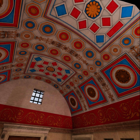
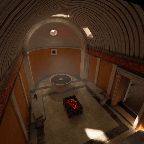
You live or die in the immersive VR market based on having believable graphics that transport you somewhere. Vita Romae has very good graphics for most spots. These clearly did a lot of work here. Unlike Pompeii, this isn’t captured from any real locations, it’s all created from the ground up based on historic information and an artist’s touch.
Ambient sounds help bring it to life along with open windows letting light stream in with shadows and highlights. All in all, there’s a very realistic feeling when you are in a given spot. I particularly love how the Romans decorated with beautiful mosaics, paintings, and the shape of the buildings themselves. Lots of curved lines and open settings make for a comfortable aesthetic.
Information Content
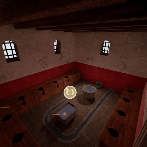
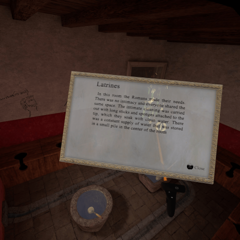
This is definitely a weak spot, or at least very flawed in my viewing. As you move around, you look for the little Roman laurel with the “i” in it. Activating this brings up an info card. Afte reading, you can press a button to make it disappear. Unfortunately, it’s pretty awkward in practice.

When you activate the info hot spot, the text card doesn’t just appear, it animates into view by moving from the laurel to your face. While it’s not always your face, it’s based on where you are holding your controller, and its relative position kept requiring me to move it away so I could read it comfortably. Then, when you hide it, it animates out of view in reverse. The move-in and move-out animations take a second or two which just feels a bit unnecessarily long.
My biggest gripe with this part though, and I can only make this criticism in my own language, is that the English translations are clumsy and clearly non-native. The app is available in English, French, Italian, and Spanish. I’m sure that the developer’s native language is fine, but I wish they would have gotten some assistance with their translations since it really detracts from the value.
VR developers: I’m happy to help with cleaning up English translations for little or no money depending on the content and volume. Reach out!
Navigation and Interactivity
There’s no interactivity which is a little strange. I can’t pick up items to examine them or activate anything other than the hotspots. I feel like this is a missed opportunity, but it’s forgivable on its own.
The bigger issue is that moving around is needlessly complicated. Instead of teleporting by pointing and creating a round portal, or just moving around with the thumbstick, it took me way too long to realize that glowing columns of Roman numerals were actually teleport locations. Other than physically walking around, your only movement is to these predefined spots. You can’t even just point at them to jump. You first pull the trigger on your controller to make them appear, then a second click is required to use them. Until I realized what they were and how to use them, I almost gave up and assumed you had one fixed spot per location.
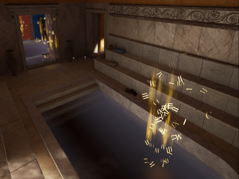
You also can’t turn your head. I really don’t understand experiences not letting you do snap-turn. It’s a small thing to implement, but without it, you can’t sit on a sofa or chair. I would imagine folks in wheelchairs don’t appreciate it either.
Another note to VR developers: Don’t reinvent the wheel! Teleporting, snap turns, and thumbstick movement are all well developed. I appreciate that there was a help info card to tell what the buttons do, but it didn’t really relate to what was in the scene.
Updates and Support
This seems to have been developed and released with no updates. It’s from 2020, so I think this is it.
Summary
I really wanted to like this. Given the cost ($15 USD) at time of purchase, I had high hopes. The locations are really nicely done and there’s a good variety of places to see. I really just can’t recommend it at the price. Perhaps on sale it’s worth it, and perhaps in a different language it would be clearer.
Pros
- Great set of locations
- Well-done graphics and ambient sounds
- Wonderful recreation of the look of ancient Rome
Cons
- Awkward and confusing teleport mechanic with fixed locations
- Poor English translation
- No snap-turn
Documentary & History, Educational, Exploration

