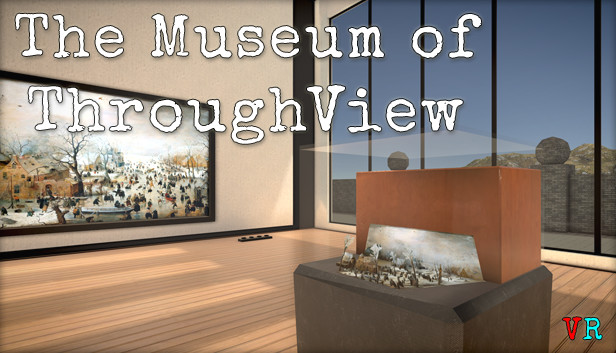
This is the first time a virtual reality app showcases 2D to 3D conversions of famous paintings and old photographs. […] There are a total of 54 paintings and photographs on display from artists such as Rembrandt, Bierstadt, Monet. Included is also a special exhibition of photographs taken in New York before 1900 by Jacob Riis.
From the product description
A museum of “2D to 3D” conversions? What does that even mean? Read on to see how this experience provides a unique way to enjoy some paintings and photographs.
About the Experience
I’m always on the lookout for interesting uses for VR. I love to see the creativity that comes with exploring this medium while it’s still in its infancy. The Museum of ThroughView definitely offers a fresh take on the museum concept.
You start in a room with two paintings on the walls, a brief reference card showing how to use your controllers, and an information desk.
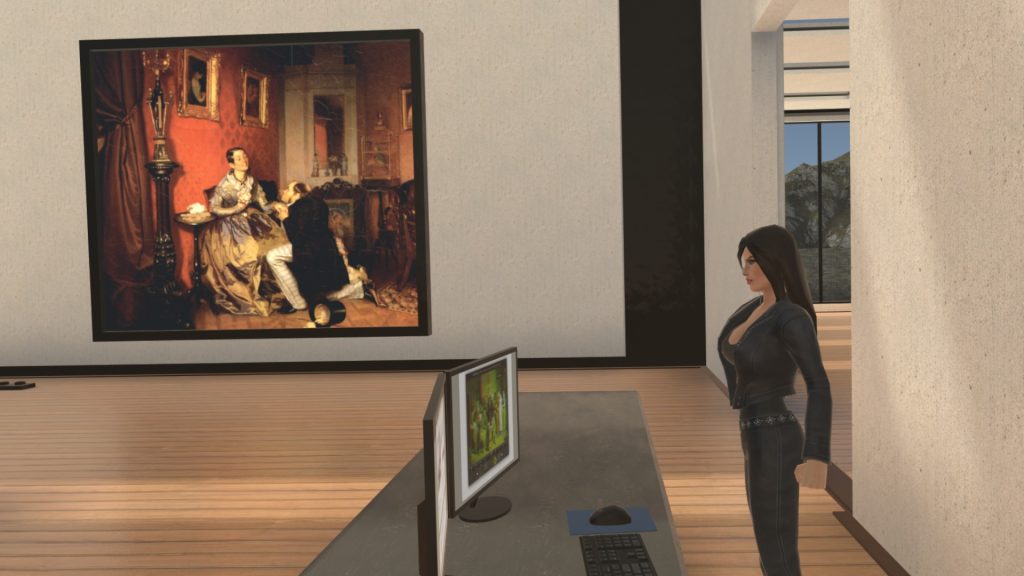
The attendant at the information desk does not appear to have normal anatomy. It’s too bad you start the experience with something off-putting and mildly sexist. She is gratuitous and adds nothing but potential offense. At least there’s nothing overtly sexual here. I could excuse it a bit if the character added any value (perhaps by introducing the museum or explaining the controller instructions), but she might as well be a statue. She doesn’t present information or even move at all. Strange choice.
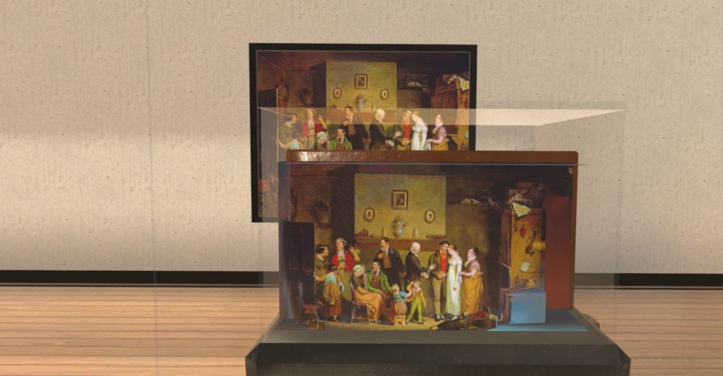
Ignoring her, though, we take in the first two paintings in the room. It’s a bit difficult to convey the effect of seeing these two-dimensional paintings in 3D. The easiest way to think of it is like layered paper art, such as in some greeting cards or popup books. It’s as though the figures and other objects have been cut out, then placed in front of each other. This effect is just enough to provide depth without radically changing the art itself. It’s well-done and adds a real pop to the presentation. Click play on the embedded tweet below to see an example of how this works.
As a bonus, each painting is accompanied by a miniature diorama on a stand in front of it. This gives you the ability to see the painting as a scene, like something built in a shoebox. At first glance, I wasn’t sure why I would want this feature, but it’s a welcome way to take in the image in a whole different way.
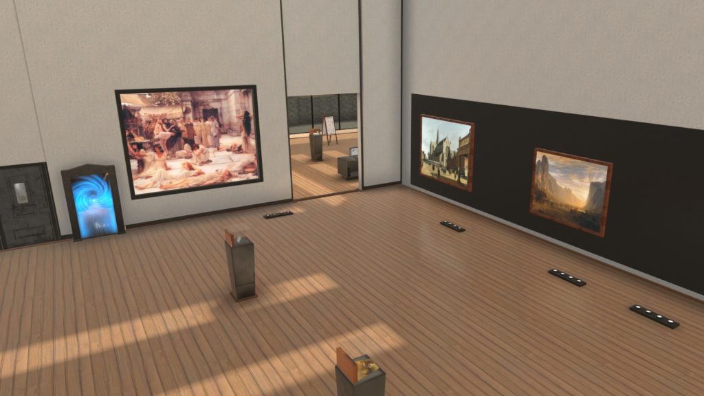
The layout of the museum is a bit confusing, so bear with me. You start out on the main level, the ground floor. There are several rooms here with artwork. In one of the rooms, there are stairs leading up to an upper level, and down to a small lower level. Notice that the Streets of New York exhibit is on both the main floor and the upper level. The lower level is quite small.
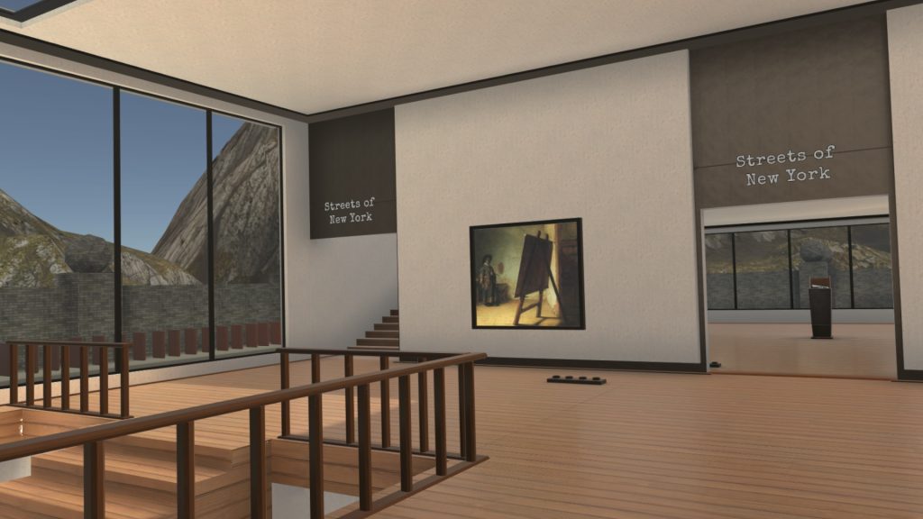
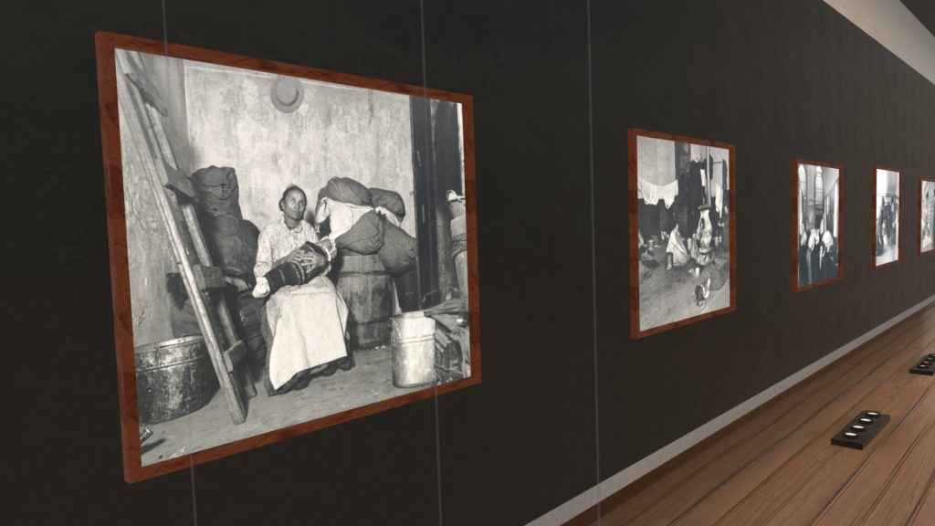
The Streets exhibit is very nice and includes converted vintage black-and-white photographs of people in tenement conditions, taken by Jacob Riis, a Dutch photographer who helped to promote urban reform. Photographs like these are fascinating to see in any form, but the 3D depth makes them even more impactful.
From the main level, a door opens to reveal a staircase going down—and I mean really down—to a subterranean level. I didn’t count, but there are about ten flights of stairs. Thankfully, you can teleport down a section at a time. Once you make it all the way down, you find another gallery that is definitely worth a visit. From there, you can activate a “portal” which allows you to easily jump between the main level and the basement instead of using the stairs. I’m really not sure why the basement is so far away from the rest of the museum, verging on hidden. Most people would probably find it, but I can imagine some folks wouldn’t think of the closed door as relevant.
Graphics
The graphics throughout are good. The museum itself has a creative layout that makes good use of the virtual space. The separate rooms, the small lower level, and the upper level all look right and would work equally well in a real building.
The 3D conversions of the artwork are excellent. They are the main attraction of the experience, of course, and I think that they add enough value to the original art to make this whole experience worth it. The source materials (the original scans of the paintings and photographs) are sufficiently high-quality to prevent blurriness at close inspection. I also like the frames around the artwork.
It’s important to note that the conversion process creates the depth layers from a completely flat image. This means that if you look at the edges of the image, you’ll see artifacts, often smearing, behind the cut-out items. This doesn’t really detract from the experience as long as you know to keep your viewing within the optimal range.
Information
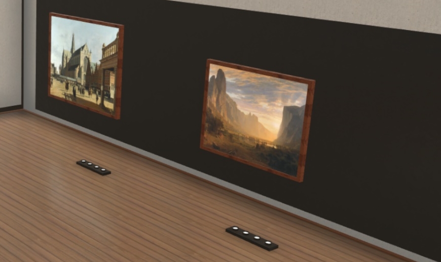
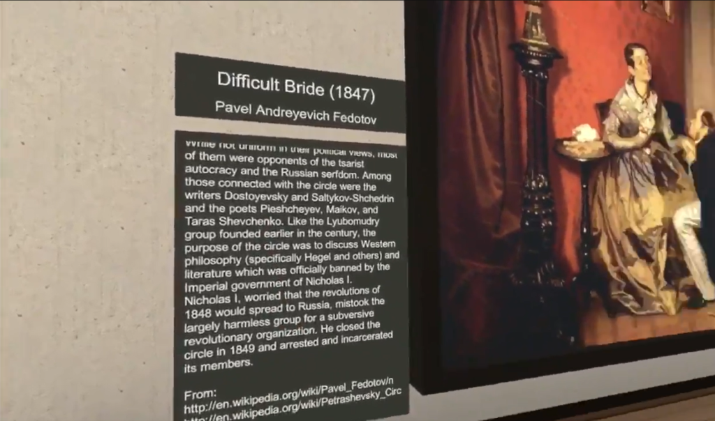
Most of the pieces of art have information points nearby that look like sets of four upward-facing lights on the floor. When you get close to one of these points, a panel appears with information about the artist and the art itself. The panel disappears when you walk away.
The content on the popup panels is interesting and worth reading. In addition to the title and artist, there are some details about the artist and work taken from various sources. If you only look at the images, you aren’t getting the full benefit.
Interactivity
This museum does have elements of interactivity, but I’m not sure why. You can open a door on the main floor to go outside, where you can throw or roll a ball at a line of domino-like objects to watch them topple over. A room in the basement contains a number of objects like a pillow, lamp, and ping-pong paddle that you can pick up and throw. Perhaps the developer just wanted some extra practice, or maybe these features are for kids who get fidgety while spending the afternoon in a quiet museum.
Future Potential
It doesn’t look like this app is under active development. There are a few messages on its discussion board on Steam, but none have responses. I’ve reached out to the developer, and it sounds like there could be an update at some point. He says he is learning a new graphics engine (the foundation of the graphics features) and has ideas for new collections.
Note that the official ThroughView site has a gallery page with converted paintings (some in the museum, others not). These images require anaglyph (red/blue) glasses to view and don’t support VR. They’re still fun to look at though.
Summary
Pros
- Creative concept
- Well-done 3d conversions
- Good variety of work
Cons
- Questionable help desk woman
- Out of place interactive objects
- Somewhat hidden subterranean level
The main elements of this experience are great. It’s an excellent idea to expand a nice selection of paintings and photographs into 3D, and the developers pull it off well. The few problems I noted aren’t enough to take away from the experience, and a future update could fix them.
If the app was being periodically updated, its $10 price tag would be fair. As it is, I bought this experience on sale and feel that I got my money’s worth. If you see it on sale again, you might want to pick it up.
Sound off in the comments about how you feel about 2D-3D conversions like this. Any similar experiences we should look at?

