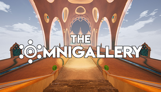
Most virtual museum experiences try to be faithful to their real-world analogs, while others take chances and invent something entirely different. Why be constrained to four walls, a floor, and a ceiling? We have physical constraints that prevent us from building out our imaginations, but in a virtual world almost anything is possible. OmniGallery is an attempt at creating a museum experience that could only exist within a headset. Is it worth the trip? Keep reading to learn more.
About the Experience
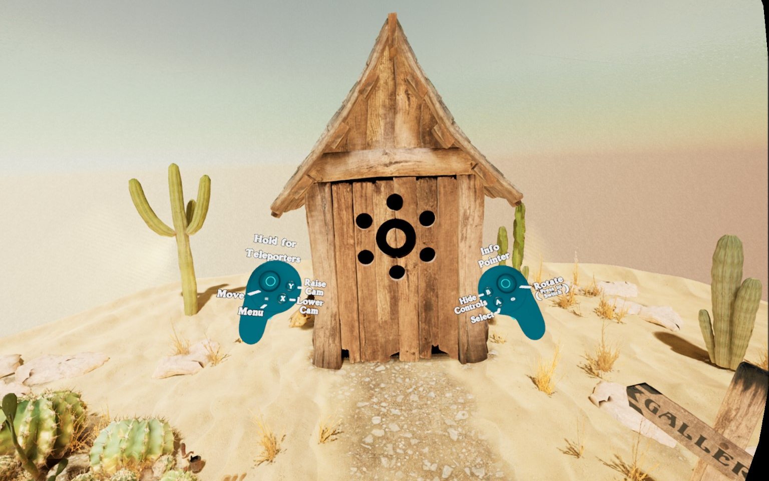
When I first launched OmniGallery, I was a little confused. I seemed to be in a desert, in front of an outhouse. There was no tutorial or text to help me to get started, so I just started pressing buttons on my controller. Thankfully, there was an option to show commands directly overlaid on the controllers, so that helped me a bit! As cute as the scene is, I didn’t think it did a very good job of acclimating the user, so points off right out of the gate.
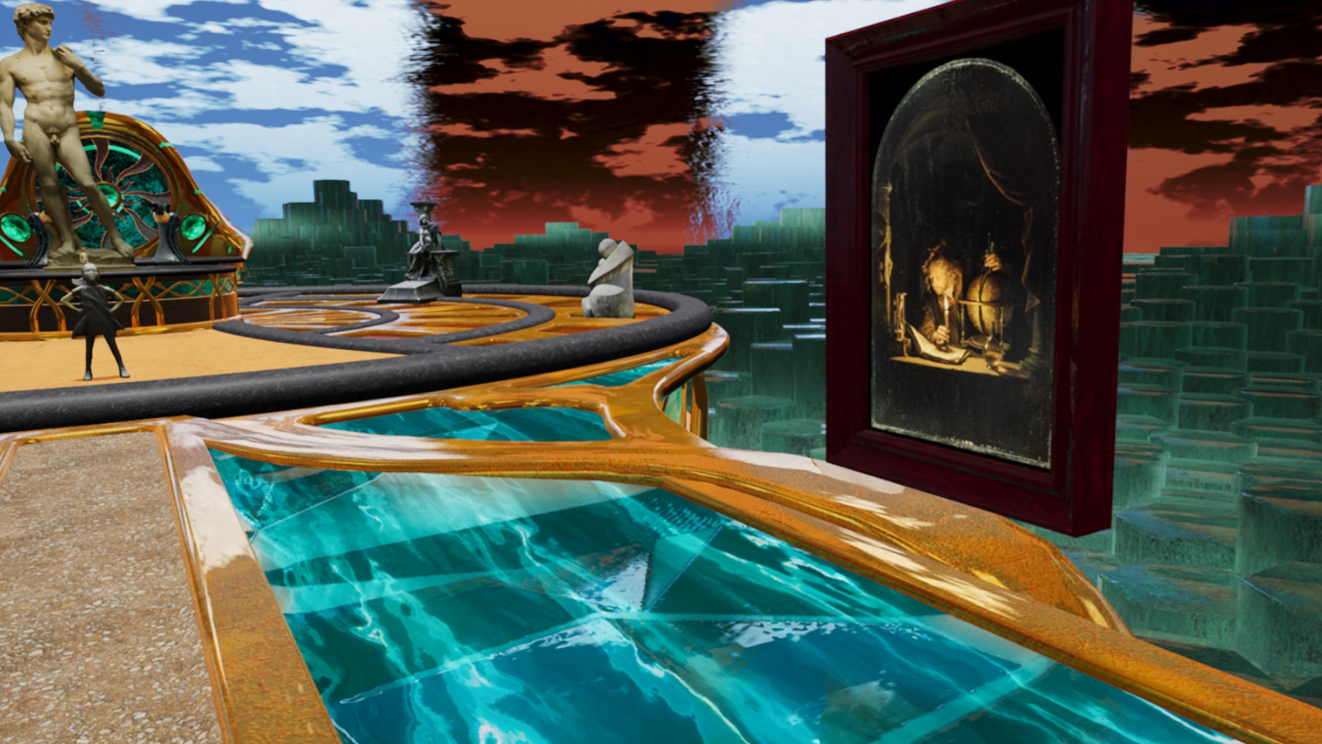
Once I figured out how to navigate to the galleries, I chose the one called The Vault. It was unlike any museum I’ve ever imagined. Instead of a ceiling, there was a blue sky with clouds passing overhead. There were odd overhead shapes with shifting colors. The floors were a combination of different materials: some solid, some liquid, some metallic, some glass. There were no walls. The walkway had what appeared to be a drop-off with basalt columns surrounding it. I’ve never tried psychedelic drugs, but I imagine the experience must be something like this.
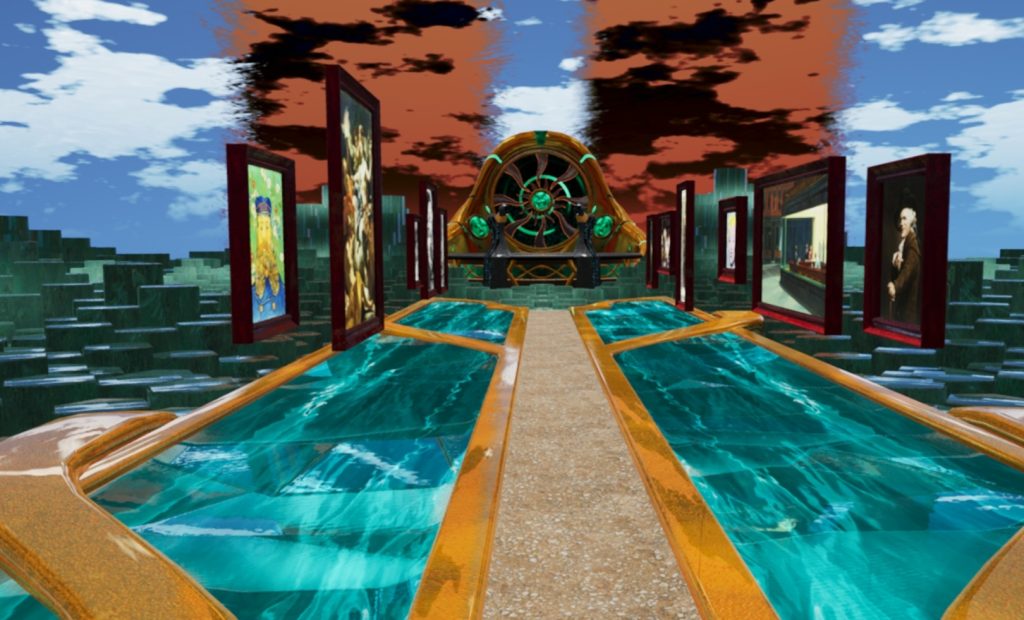
As you walk down the hall/boardwalk, there are framed paintings and photographs on display. The product description claims 250 items are included across the entire museum. Many of these I recognized as famous works, but not surprisingly I wasn’t familiar with all of them. The framed items float in the air but are otherwise as you would expect them to be. The scans are high quality, likely taken from Google Arts and Culture or some other public repository.
In addition to the paintings, there are also statues and sculptures. Some of these are just placed along the path in a spot where a picture frame might otherwise be, while others have their own pedestals or platforms. A few of the really large ones had miniature versions nearby for a closer look. I don’t think they were really to scale, though I’m not completely sure of this.
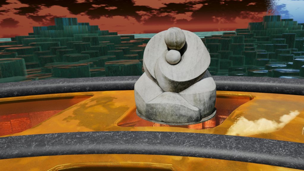
In addition to the paintings and statues, there are non-traditional creations in many areas. Some of them have animated elements to them, others are just static. These serve no purpose except to amplify the sense of surreality. They’re worth looking at in their own right as post-modern art pieces, but definitely make it clear that this is a fictional setting.
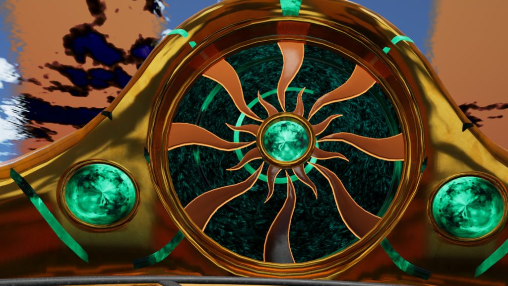
As you wander around, you may come across transporter portals. These are doorways and arches that take you to other “universes” (rooms/realms). There are three different such areas plus a central “home” area called the Main Hall. These areas can also be navigated to directly using the menu button on the left controller.
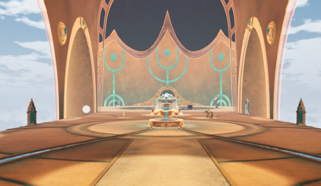
Main Hall
This is a large open floor similar to being inside a dome except the outer walls have large open areas. I think the idea is to present content here, but so far, it’s mostly just a wide-open space other than four or five items.
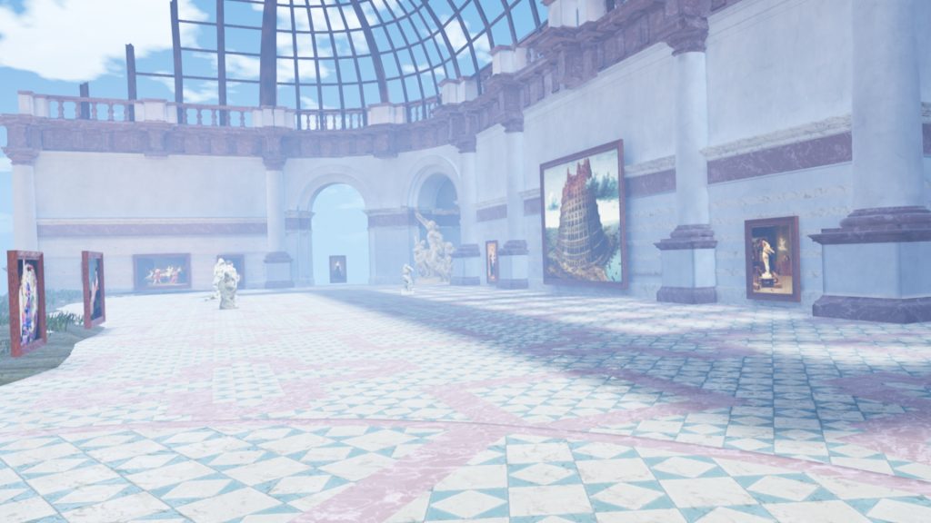
Classic Hill
This area is part inside and part outside. The inside area is within a building with a glass-panel ceiling, like an old greenhouse perhaps. Outside of this is a hill and a path leading around it with various classics (pre-modern) showcased throughout.
The Vault
This area includes a water-like floor with basalt regions. The web site states that the items here will eventually be moved to more specific areas as they are created. This makes sense since there’s not really a strong theme anywhere. Artists, styles, and time periods are mingled together.
Diorama-Rama
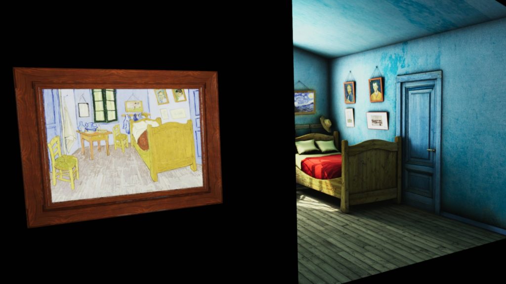
This is the more experimental/modern area which contains digital art of various sizes including a room-scale recreation of Van Gogh’s Bedroom in Arles. Some of these are pretty interesting and could only be displayed meaningfully in VR. The alternative would be projectors or displays within a museum, which I’ve certainly seen, but being able to see it at true scale right next to you is a much better experience.
Graphics
The graphics are well done. You may or may not like the presentation, but the environment (floor, sky, assorted creative items) are colorful and carefully made, the artwork is detailed (you can get up close), and there are some bonus elements to look out for.
A few of the paintings have 3d conversions (similar to Museum of ThroughView). This means that you can stand at different angles in front of a painting and the see the correct perspective. This can be a very cool effect when done well. If you don’t like it, there’s a button underneath to toggle between 2d and 3d.
There are settings for graphics so you can adjust it based on how powerful your system is. There’s a general Quality setting of Low/Medium/Normal, plus an option for Post Processing. I’m not sure how many users would be familiar with this term, but it’s kind of like an extra bump to quality. Often it does things like improve shadows, reflections, or water. It’s a generic term, so there’s no way to know which specific changes it makes, but generally it’s worth turning on unless your video starts to get choppy from the extra work on your graphics card.
Information
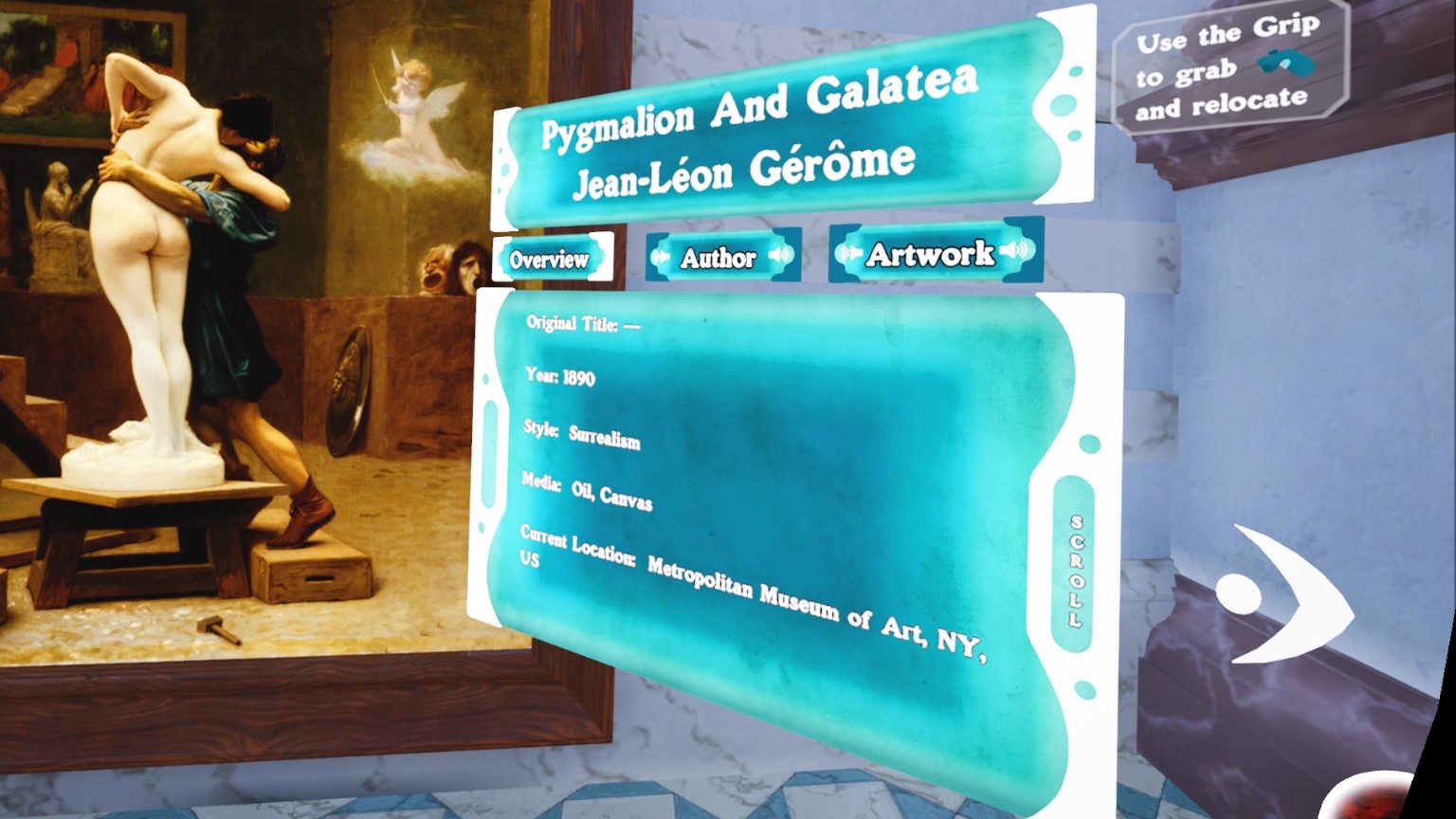
Information is hit or miss. If you point and click at an item, there’s an information card that pops up with up to three sections: Overview, Author, and Artwork. Overview is some general metadata including year, style, media, and location. Author provides some biographical information about the artist, and Artwork provides some details about the work. Unfortunately, many pieces only have the minimal details under Overview.
For items with Author or Artwork, there is a speaker button to hear it read by a female voice. Her accent is a little strong and her English pronunciation is sometimes wrong, but it’s a nice effort. The app is available in both English and Spanish, but I didn’t test it to see if the same person voices in Spanish.
Interactivity
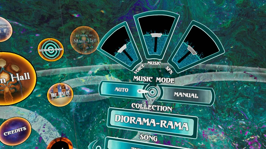
None of the works were interactive. This is a museum for looking, not virtually touching. Within the menu, there are settings to play music and various sound effects and to switch between English and Spanish. You can also jump to the different rooms including one that displays the credits. As with everything else, the menu is a bit trippy too.
Movement is a little odd. Thankfully you can teleport to avoid the sick feeling (that I get anyway) from smooth movement. I’m accustomed to pointing to a spot to select where to go, but here you squeeze the trigger button, then simply angle your head until a flower-like item appears where you want to go, then you release the trigger. It’s easy enough, but not intuitive.
Future Potential
Having looked at the creator’s web site, there should be more areas and items displayed in the future. He states that there are a few hundred scanned paintings and an additional few hundred scanned sculptures that he needs to process and organize into appropriate settings. When all the space is virtual, you never run out!
Summary
Pros
- Large selection of artwork
- Creative gallery layouts
- It’s free!
Cons
- Might be too psychedelic for some
- Could use more details about the works
- Needs an introduction with some instructions
The creator calls this a “multiverse of virtual exhibits.” It’s not the only virtual museum that I’ve seen with virtual content (in addition to the real-world artwork), but it’s the boldest! It looks like a lot of work went into it, and it’s an interesting concept. Unfortunately, I think it needs some polish to get to that next level. As someone who typically isn’t as interested in highly abstract imagery, I’m not clear why this approach even makes sense, especially for the classical works. I think it’s still worth giving it a try but temper your expectations accordingly. On the other hand, to someone more artistically inclined, maybe it’s already a masterpiece! Let me know if you agree or disagree in the comments.

